
Petoskey Area Visitors Bureau
Client:
Role:
Design Director
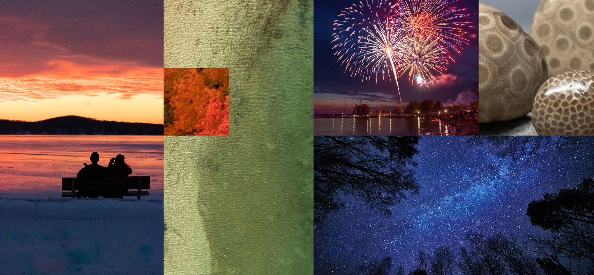
The Petoskey, Michigan area was always well-known regionally as a quaint, summer getaway, but its brand wasn’t realizing its potential. Its visual identity was dated, with no distinguishing personality, and no one seemed to be aware of everything there was to do in the area during the fall, winter and spring.
PETERMAYER’s team devised a brand identity that leans into the surreal magic of nature, positioning the Petoskey Area as a fantasy world with new adventures and wonders to discover in every season, where the weary can escape the mundane and experience something almost supernatural.
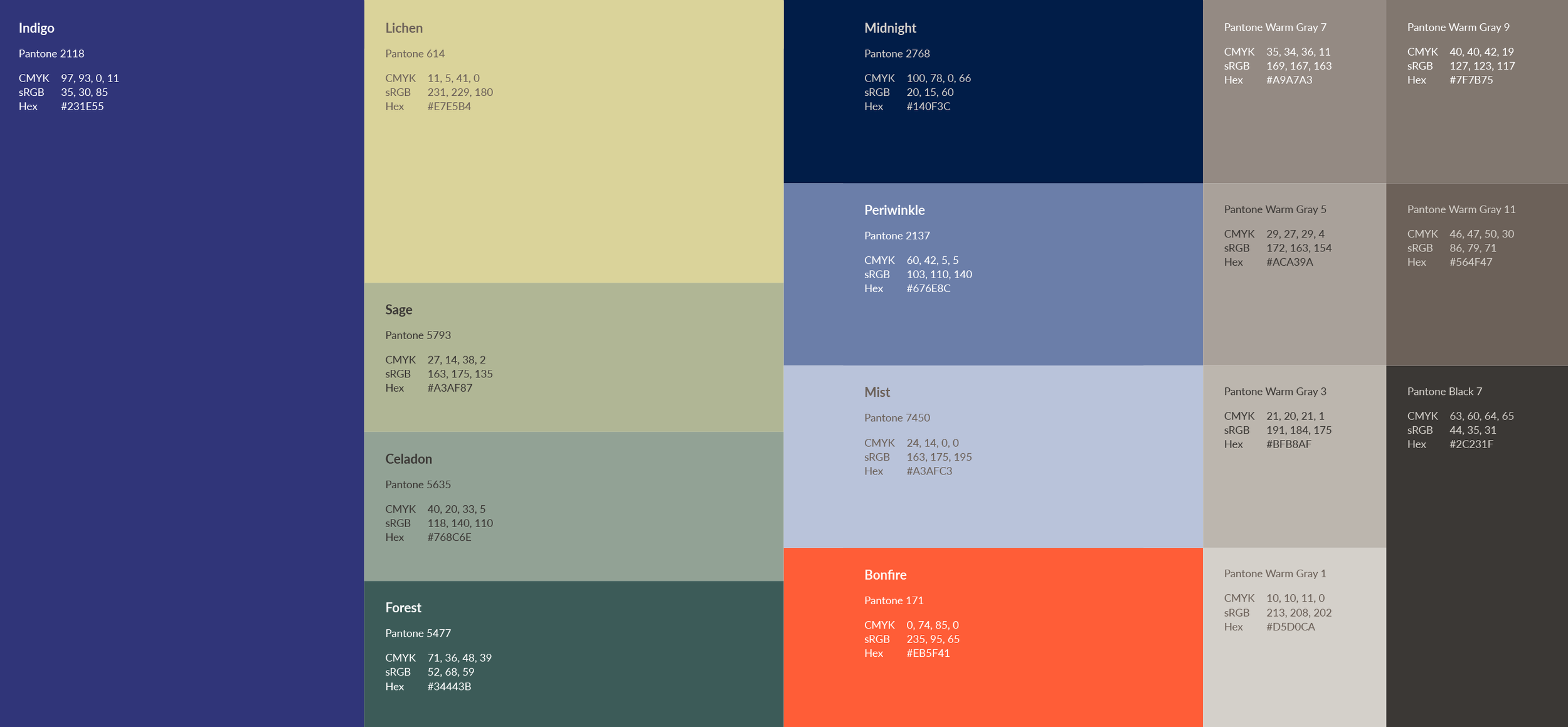
I led the design team responsible for the visual identity, including a complete logo suite, color palette, typographical system and comprehensive brand standards.
The Charm
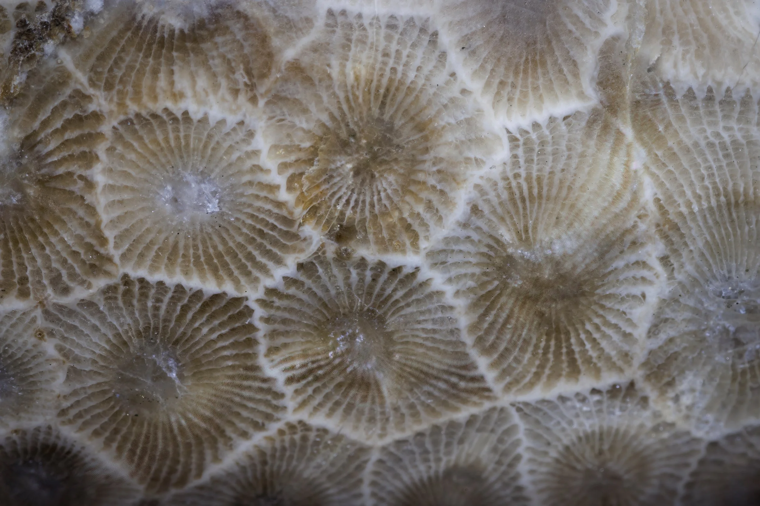
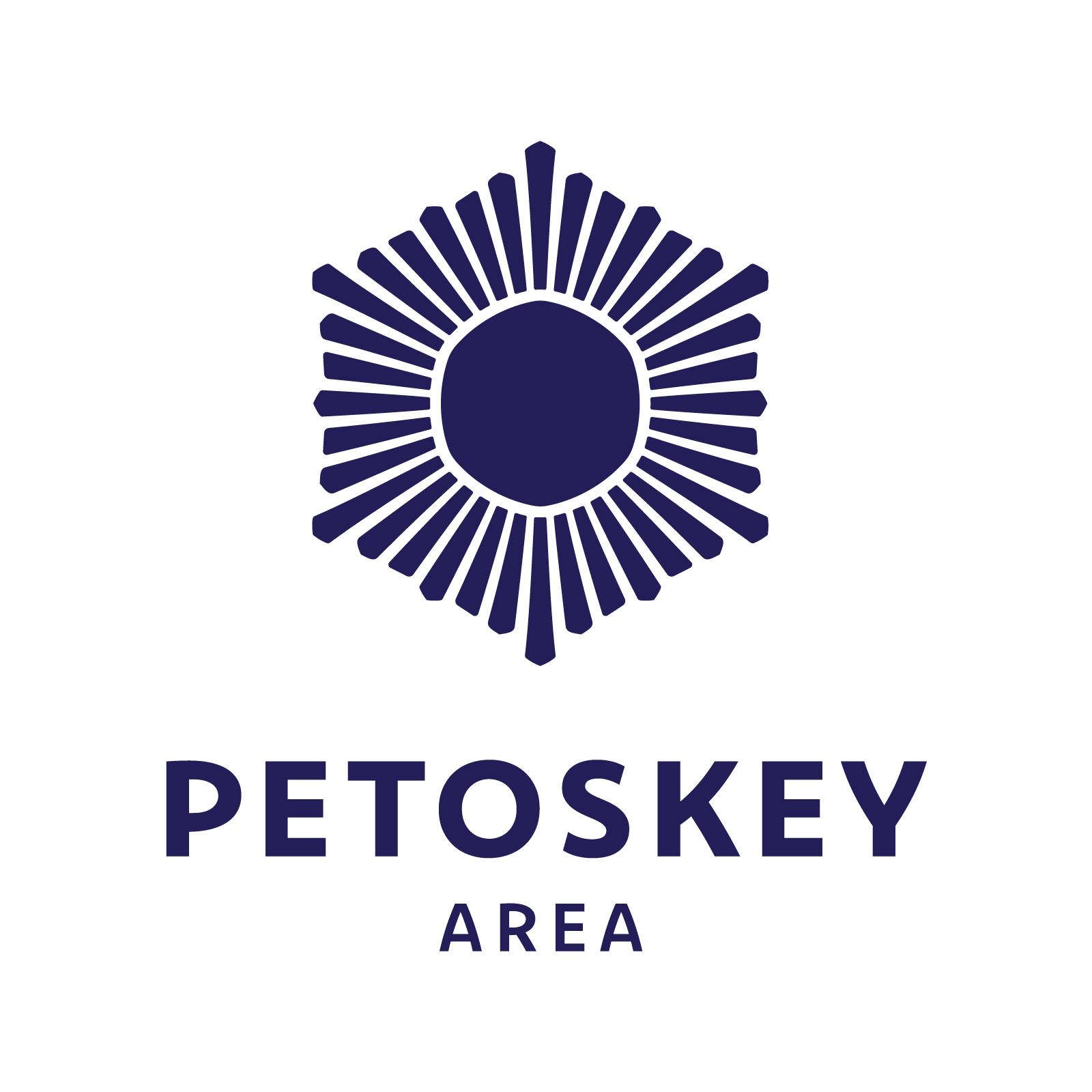
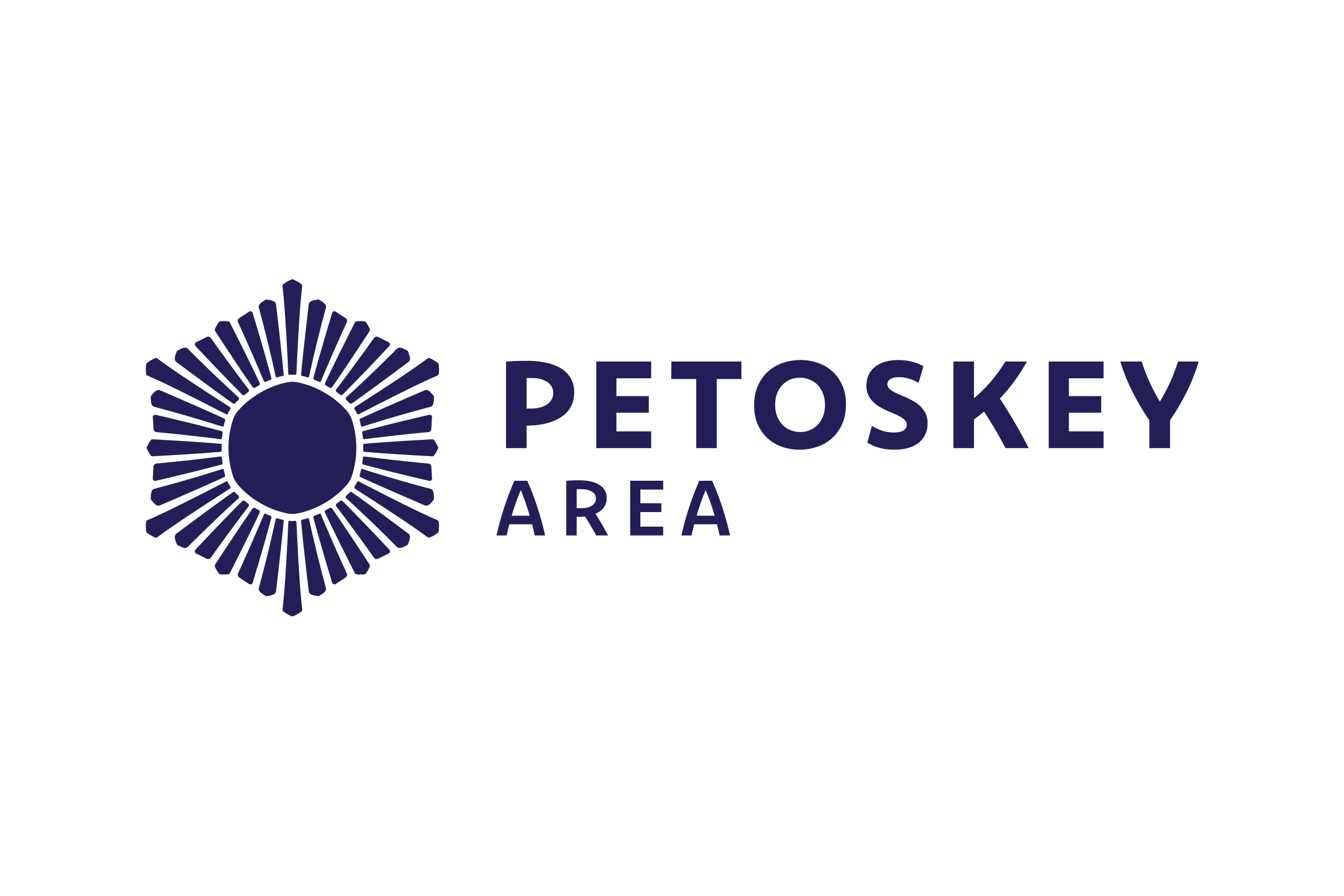
The primary logo mark is a graphic distillation of three symbols evoking the Petoskey Area’s natural beauty throughout the year. The sun and snowflake represent opposite ends of the seasonal cycle, along with the exciting activities available at different times of year. The Petoskey Stone pattern is a marker of local pride, and a symbol of the area’s natural history.

+
+


These symbols combine to form the “Charm,” the primary symbol of the Petoskey Area visual identity. The Charm is an arcane talisman, evoking magic, mystery and nature. It glows with energy, but its symmetry describes balance, stability and calm. Its weathered edges feel handmade and gentle, as if carved from stone.
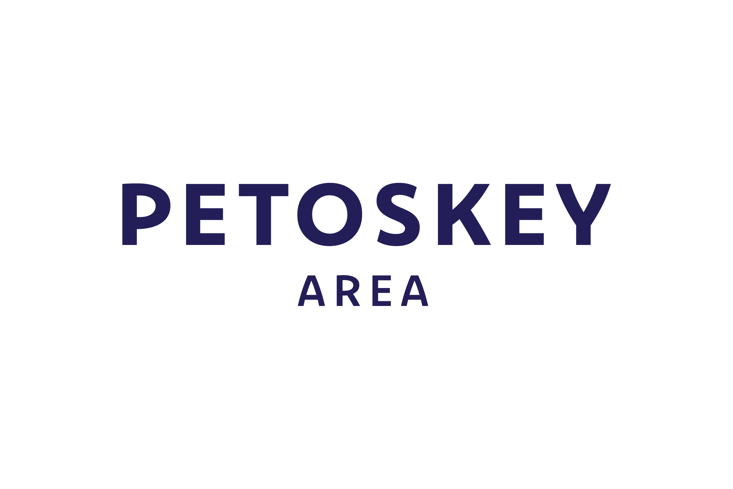


With chiseled edges and subtle tapers, Dejanire Sans is full of little imperfections that perfectly reflect the naturally weathered sense of calm and magic we wanted to evoke.